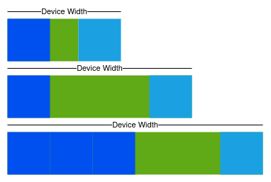
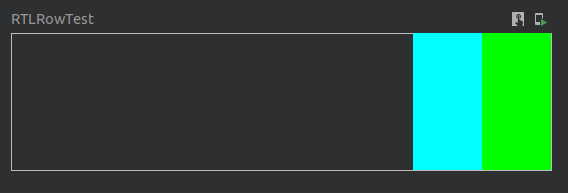
Lets imagine that one day we receive a layout design for a new screen from the designer, and that it looks something like this:
Super easy, barely an inconvenience
The design also comes with some minor instructions.
- The cyan rectangle never changes its size
- The cyan rectangle is always on the right side of the screen
- The green rectangle takes up the remaining horizontal space, filling the remaining width
- The green rectangle can be populated with as many dark blue rectangles as can fit inside it
With these instructions in hand we decide to create a composable containing a Row set to fill the width of the screen and contain two children; a Box (the cyan rectangle) and another Row (the green rectangle). These children will be laid out right-to-left. The child Row will be configured to fill up any left over space in the parent and be populated with its own child Boxes (the blue rectangles).
First we setup the skeleton of the composable:
@Preview
@Composable
fun RTLRowTest() {
    Row(
        modifier = Modifier
            .fillMaxWidth()
            .height(100.dp),
    ) {
        Box(
            modifier = Modifier
                .fillMaxHeight()
                .width(50.dp)
                .background(color = Color.Cyan)
        )
        Row(modifier = Modifier
            .fillMaxHeight()
            .fillMaxWidth()
            .background(color = Color.Green)){

        }
    }
}
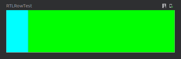
The layout that this produces looks just like this, with the cyan Box on the left hand side and the remainder of the screen width taken up by the green Row:
Almost there, just need to flip the horizontal arrangement
As we look at the API documentation for Row we see there is a parameter called
horizontalArrangement described as:
and that one of the values it accepts is Arrangement.End whose documentation is
This sounds like what is needed for arranging the top most Row’s children right-to-left so that the child Row (the green one remember) can automatically grow to fill the screen’s width as it changes.
@Preview
@Composable
fun RTLRowTest() {
    Row(
        modifier = Modifier
            .fillMaxWidth()
            .height(100.dp),
        horizontalArrangement = Arrangement.End
    ) {
        Box(
            modifier = Modifier
                .fillMaxHeight()
                .width(50.dp)
                .background(color = Color.Cyan)
        )
        Row(modifier = Modifier
            .fillMaxHeight()
            .fillMaxWidth()
            .background(color = Color.Green))
    }
}
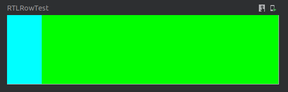
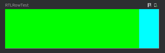
What this produces however is not quite what was expected. The layout looks identically to as it was before!
Was expecting something different to be honest
Now perhaps the layout also needs its children to be declared in the order of which they will be placed on the screen. And so we swap the composable functions around:
@Preview
@Composable
fun RTLRowTest() {
    Row(
        modifier = Modifier
            .fillMaxWidth()
            .height(100.dp)
        horizontalArrangement = Arrangement.End
    ) {
        Box(modifier = Modifier
            .fillMaxHeight()
            .fillMaxWidth()
            .background(color = Color.Green))
        Row(
            modifier = Modifier
                .fillMaxHeight()
                .width(50.dp)
                .background(color = Color.Cyan)
        )
    }
}
Alas, this does not fix the issue as now the green Row takes up the whole screen width, completely blocking the cyan Box from being displayed.
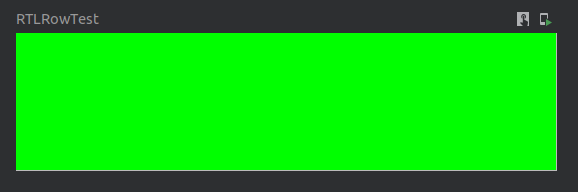
Now that's just plain rude, blocking the cyan Box completely like that
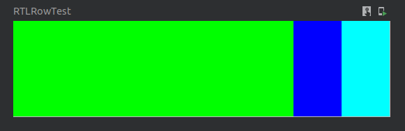
There is obviously something more going on here than we realize. To get to the bottom of the issue we first set the green Row’s width to match the cyan Box’s.
And wouldn’t you know it, the issue becomes clear immediately!
horizontalArrangement doesn't do what we initially thought it did
It turns out that the order that Row places its children in is the same as the order they are declared in, no matter what horizontalArrangement value is given to the Row.
They do however gravitate towards the given arrangement. In that respect horizontalArrangement functions similarly to how the old android:gravity parameter worked in the old view system.
It is at this point dear reader, that we take a better look at the previous mentioned documentation for horizontalArrangement and Arrangement.End and now realize we completely misunderstood them the first time we read them!

The programmer is usually at fault, not the framework
How can we then set the layout direction of the top level Row so that it will arrange its children right-to-left like we wanted in the first place?
It is important to realize that Compose treats each composable function as a node in a tree (which is also what the old view system did), and that at any point in that tree structure values can be defined to be made available to the subsequent branch below.
For instance this is how a theme can be set at the root of the application tree and be made available to all composables anywhere in the tree to use, without them having any real knowledge about the theme it self.
For configuring these more localized values there is the CompositionLocal described as:
To supply new values to the CompositionLocal we simply use the CompositionLocalProvider and give it the layout direction that we would like the subsequent branch of the UI tree to use. The value will then be made available to the internals of the Row and it will lay out its children in the proper way:
@Preview
@Composable
fun RTLRowTest() {
  // Here we assign the RTL direction to be used in the Row below
  CompositionLocalProvider(LocalLayoutDirection provides LayoutDirection.Rtl) {
      Row(
          modifier = Modifier
              .fillMaxWidth()
              .height(100.dp),
      ) {
          Box(
              modifier = Modifier
                  .fillMaxHeight()
                  .width(50.dp)
                  .background(color = Color.Cyan)
          )
          Row(modifier = Modifier
              .fillMaxHeight()
              .fillMaxWidth()
              .background(color = Color.Green))
      }
  }
}
With this addition we finally have the arrangement that we wanted, going from the right to the left side:
That looks more like it!
The last bit is to add the blue Box inside the green Row, to fulfill the design specification.
@Preview
@Composable
fun RTLRowTest() {
  CompositionLocalProvider(LocalLayoutDirection provides LayoutDirection.Rtl) {
      Row(
          modifier = Modifier
              .fillMaxWidth()
              .height(100.dp),
      ) {
          Box(
              modifier = Modifier
                  .fillMaxHeight()
                  .width(50.dp)
                  .background(color = Color.Cyan)
          )
          Row(modifier = Modifier
              .fillMaxHeight()
              .fillMaxWidth()
              .background(color = Color.Green)) {
              // We add a blue box to the child Row to finish covering the requirements
              Box(
                  modifier = Modifier
                      .fillMaxHeight()
                      .width(50.dp)
                      .background(color = Color.Blue)
              )
          }
      }
  }
}
However looking at the output we see that this doesn’t exactly give us what we wanted:
We seem to have messed up the direction in the subsequent branch in the UI tree
Remember what was said before about how values configured in the graph would be available to the whole subsequent branch below?
The first CompositionLocal change is made and effects the whole sub tree beneath the change
Now the green Row is using the directional parameters that were meant for its parent Row, which is causing the green Row to lay out its children in a right-to-left fashion as well. Which is not what we wanted.
The fix to this is simply to assign the directional value back to LTR in the sub graph:
@Preview
@Composable
fun RTLRowTest() {
    CompositionLocalProvider(LocalLayoutDirection provides LayoutDirection.Rtl) {
        Row(
            modifier = Modifier
                .fillMaxWidth()
                .height(100.dp),
        ) {
            // Here we revert the layout direction back to LTR
            CompositionLocalProvider(LocalLayoutDirection provides LayoutDirection.Ltr) {
                Box(
                    modifier = Modifier
                        .fillMaxHeight()
                        .width(50.dp)
                        .background(color = Color.Cyan)
                )
                Row(
                    modifier = Modifier
                        .fillMaxHeight()
                        .fillMaxWidth()
                        .background(color = Color.Green)
                ) {
                    Box(
                        modifier = Modifier
                            .fillMaxHeight()
                            .width(50.dp)
                            .background(color = Color.Blue)
                    )
                }
            }
        }
    }
}
And now the layout looks exactly like what we were going for:
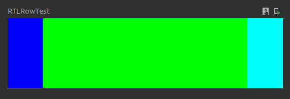
We finally have the desired layout!
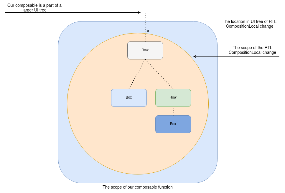
Visually, what has been done to the UI tree is the following:
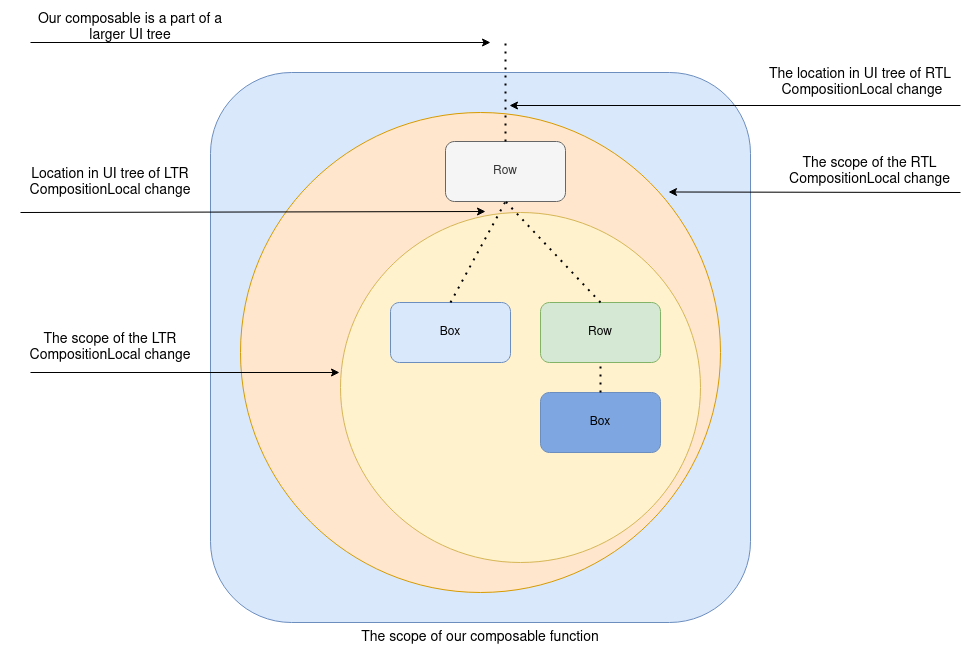
The second CompositionLocal change effects the
One thing to keep in mind is that the preferred layout direction of the device can be configured by the user on a global level, and as such our implementation should keep that in mind and not force a direction just to match our design.
So rather then hard coding a specific layout direction we can use an extension function to always flip to the opposite direction, thus keeping the UI consistent:
fun LayoutDirection.opposite(): LayoutDirection {
    return when(this) {
        LayoutDirection.Ltr -> LayoutDirection.Rtl
        LayoutDirection.Rtl -> LayoutDirection.Ltr
    }
}
For convenience we can also create an overloaded version of Row, initiated with the same defaults as Row, containing an additional layoutDirection parameter:
@Composable
public inline fun Row(
    modifier: Modifier = Modifier,
    layoutDirection: LayoutDirection,
    horizontalArrangement: Arrangement.Horizontal = Arrangement.Start,
    verticalAlignment: Alignment.Vertical = Alignment.Top,
    crossinline content: @Composable RowScope.() -> Unit
) {
    val originalDirection = LocalLayoutDirection.current
    CompositionLocalProvider(LocalLayoutDirection provides layoutDirection) {
        Row(
            modifier = modifier,
            horizontalArrangement = horizontalArrangement,
            verticalAlignment = verticalAlignment,
            content = {
                CompositionLocalProvider(LocalLayoutDirection provides originalDirection) {
                    content()
                }
            }
        )
    }
}
Finally using these two pieces of code, our composable will look like this:
@Preview
@Composable
fun RTLRowTest() {
    Row(
        modifier = Modifier
            .fillMaxWidth()
            .height(100.dp),
        layoutDirection = LocalLayoutDirection.current.opposite()
    ) {
        Box(
            modifier = Modifier
                .fillMaxHeight()
                .width(50.dp)
                .background(color = Color.Cyan)
        )
        Row(
            modifier = Modifier
                .fillMaxHeight()
                .fillMaxWidth()
                .background(color = Color.Green)
        ) {
            Box(
                modifier = Modifier
                    .fillMaxHeight()
                    .width(50.dp)
                    .background(color = Color.Blue)
            )
        }
    }
}
I hope this helped explain a bit the idea of a CompositionLocal and how LayoutDirection can be used. For further reading I recommend checking out the official documentation.